Workout Intensity Diagrams
It’s summer here on the northern hemisphere and that means the rowing season is well underway. As we train towards the season’s most important competition (be it a regional regatta or the world championships), many training programs increase variation in workout intensity to improve race performance, building on the foundation of long steady-state training sessions in the winter.
With Analytics, you can now track and review the intensity of each of your recorded rowing workouts in the logfiles view.

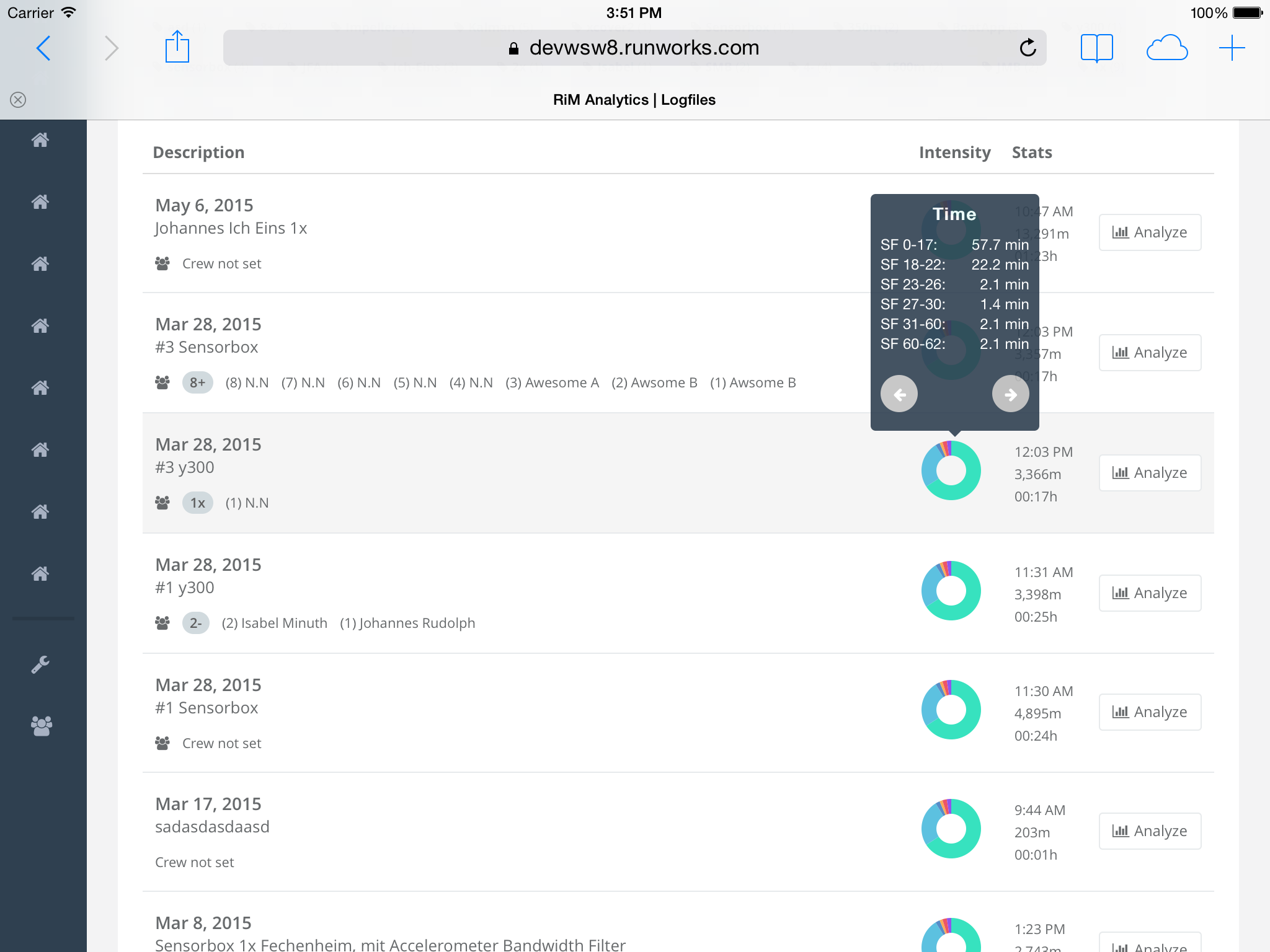
Workout intensity by time.
The “donut” diagram is a histogram and by default it shows the proportion of time spent in one of 6 intensity zones. The intensity zones are defined based on stroke-rate, which offers some serious advantages over a definition based on heart-rate. Stroke-rate correlates very well with total power generated, while heart-rate has a significant lag in the response to a change in power production. Heartrate is highly individual for every member of the crew and studies have shown that there is significant variation in day-to-day heart-rates at constant workout intensity and training status (source). This makes a definition of intensity zones based on heart-rate difficult, requires input of a lot of background data and the requirement to wear a heart-rate strap during every exercise is not very practical.
Stroke-rate data on the other hand is easily comparable and always available. While there may be variations between the work-per-stroke between crews (and boat classes) and consequently some crews preferring higher or lower stroke-rates, these variations are typically in the range of +/-2 strokes. We thus chose the following 6 intensity zones, which we found correspond well with traditional training intensity measures:
- SF 0-17: Rest or recovery. Heart-rate typically below aerobic threshold.
- SF 18-22: Steady state. Heart-rate typically near aerobic threshold.
- SF 23-26: Intensive endurance. Heart-rate typically between aerobic threshold and anaerobic threshold.
- SF 27-31: Highly intensive endurance. Heart-rate typically above anaerobic threshold.
- SF 32-40: Competition specific performance. Maximum 2000m race performance.
- SF 40-60: Power > 2000m performance.
We feel this is a good starting point. We would of course welcome a more scientific approach to this based on a larger set of data samples, but it appears this is a topic that has not been well researched yet (or the research is not well discoverable). The definition of above intensity zones however match very well with the data samples we have at hand and many years of coaching experience we consulted.
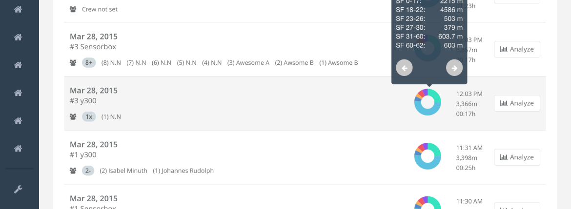
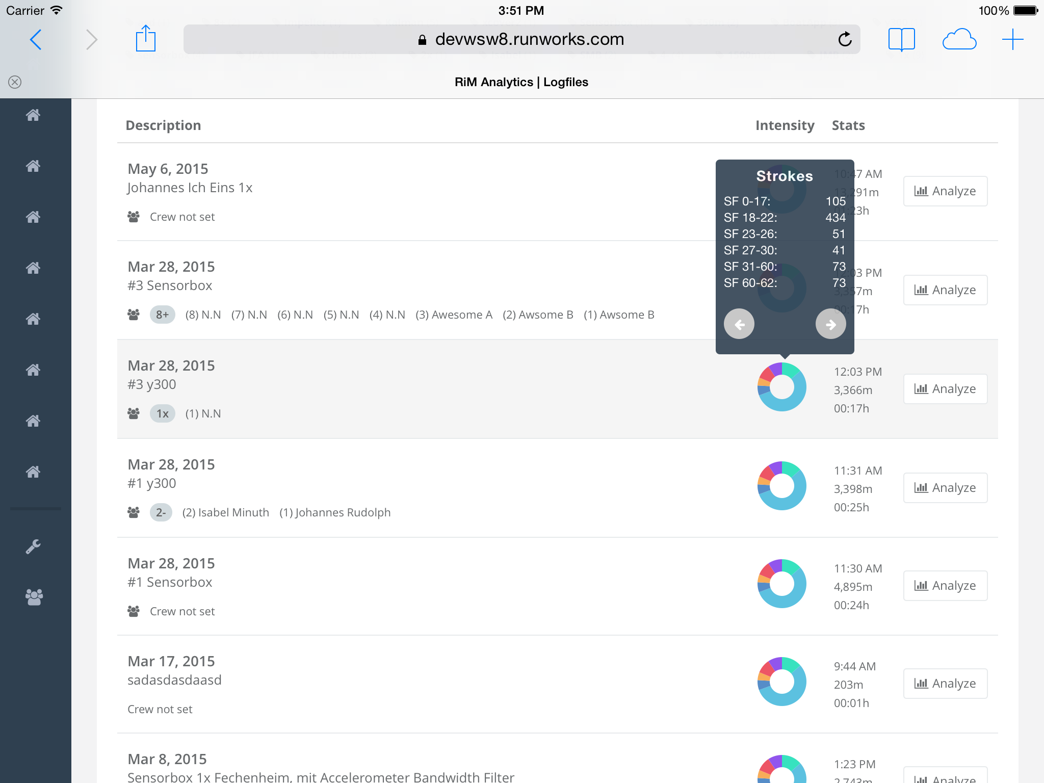
Let’s look at the diagrams in more detail. We assign each rowing stroke in a rowing session to the corresponding intensity zone and then aggregate for each intensity zone the time, distance and number of strokes. The intensity histogram “donuts” show the proportion of each intensity zone to all other intensity zones in that logfile, starting with the lowest intensity zone at 12 o’clock and the moving clockwise. You can click on a diagram to show a tooltip with detailed data.

Workout intensity by number of strokes.
Using the navigator buttons, you can change the displayed aggregate metric between time (default), distance or number of strokes.

Workout intensity by distance.
These intensity diagrams are very useful for finding a specific logfile in the list with a specific exercise content (e.g. multiple 500m pieces at competition intensity).
We have plans to add aggregate reporting based on the intensity zones soon, which allows rowers and coaches to quickly asses training intensity and performance. This is very useful for controlling training intensity and whether the training program is being executed correctly. Any suggestions and feedback for what you would want to see in that direction is highly welcome, so please don’t hesitate to get in touch.

This will probably help you:
http://journals.humankinetics.com/AcuCustom/Sitename/Documents/DocumentItem/17324.pdf
http://www.fftri.com/files/pdf/Seiler%20IJSPP%202010.pdf