The new Rowing in Motion Analytics
70% of our Rowing in Motion Analytics Users are using it on their tablet or desktop PC. That didn’t align well with our initial implementation that was based around a smartphone-optimized user interface (that would also work well on tablets). So we changed that:
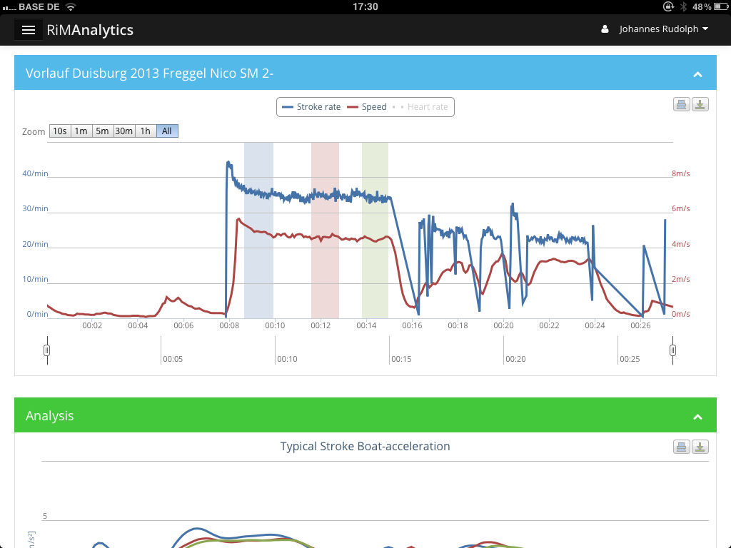
Responsive Layout
The new design is focused around a responsive layout that will automatically adapt to different screen sizes. Whether you are using it on your smartphone, tablet or desktop, the layout will automatically re-arrange its elements to give you the best possible view on your data.
Sidebar
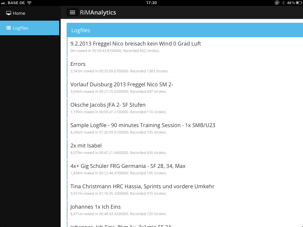
The most prominent addition to the user interface is the new sidebar that allows you to quickly navigate between different parts of analytics. You can bring it on screen using the button with the three bars at the top and it will automatically slide in and push the screen content to the side. This style of navigation allows us to keep the App accessible as we continue to add more features
Clean Design
The old design was focused to resemble a smartphone interface. The new design is much more freestanding and allows fitting more content on the screen with narrower fonts and a clean and lean look. With Microsoft introducing a similar design with Windows 8 and Apple shifting to a similar pardigm with iOS 7, we believe we are on top of the trend for functional and sexy user interface design.
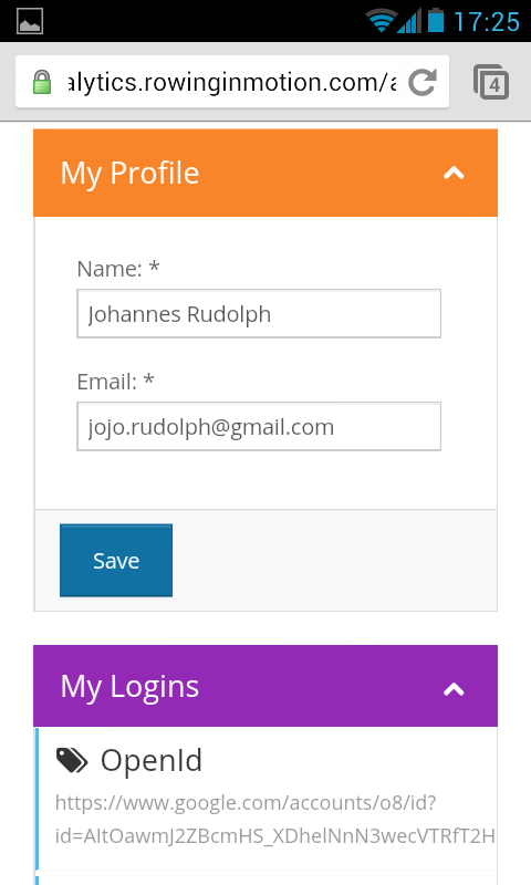
Facebook login and linking accounts
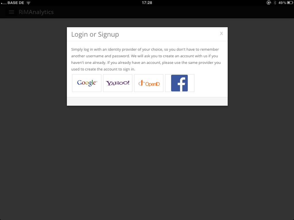
You can now also create an account by signing in with your facebook account. You can also link multiple identity providers (e.g. your google and your facebook account) to your Rowing in Motion account so you can sign in using any of your identity providers. To add another identity provider to your account, click the user button and navigate to your profile. You can add a login in the “My Logins” box using the big “Add Login” button.