Beta: Race Analysis with Analytics
We’ve been planning for some time now to add extensive race analysis capabilities to Analytics, but there’s a lot of different options on what data such an Analysis should deliver. One of the big advantages of running a web-based Analytics software is that we can instantly deploy new features for all our users – so what would be better than just building out some prototype and asking for your feedback? That’s exactly what we did. Here’s how it works.
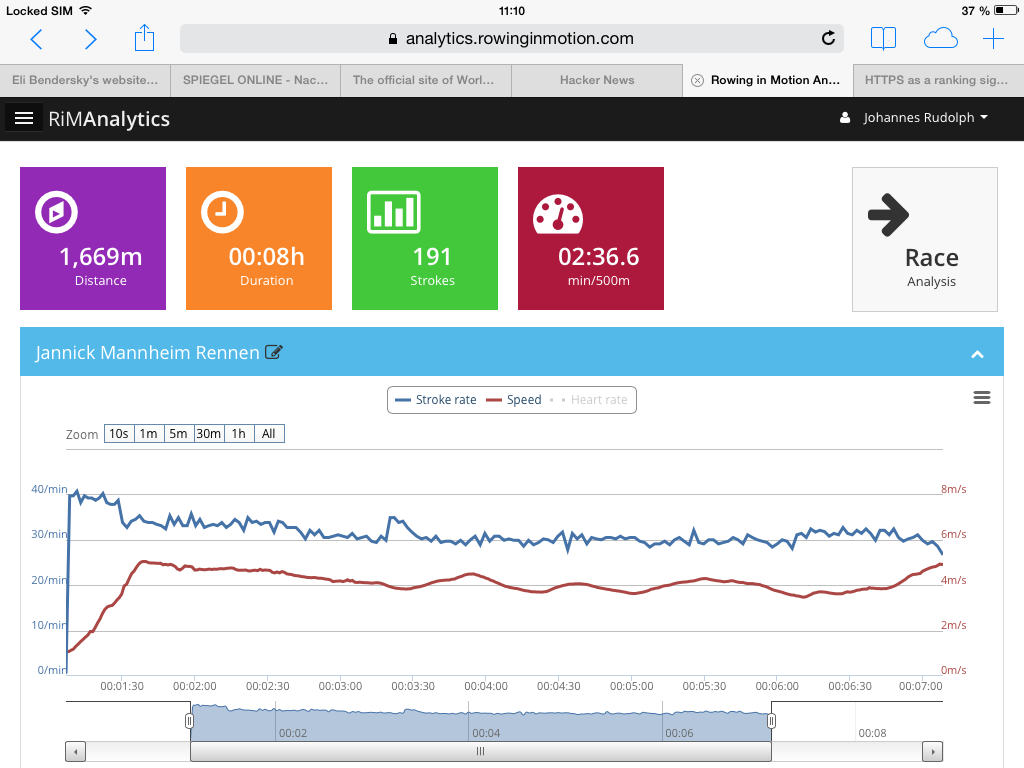
You can access the race analysis preview on the logfiles details screen, using the tile on the top right:
The race analysis screen shows a map of the exercise and lets you enter the desired race distance and split distance on the top left. 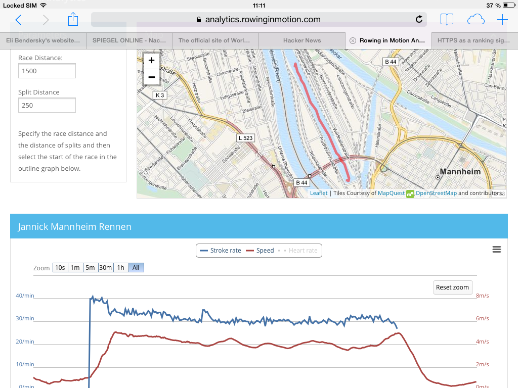
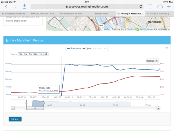
You then go on to pick the “start” of the race, from where the analysis shall begin. On touch devices this involves clicking the graph to place the marker and then clicking the “Set Start” button. If you’re using a mouse, you can just click the graph where you want the analysis to begin. In this case, we’ll place the marker before the first start stroke:
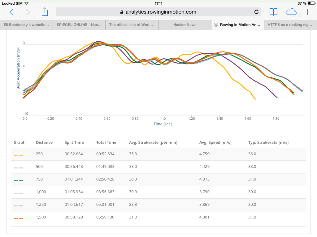
The currently implemented analysis will then calculate time, average speed, average strokerate and a typical stroke for each split. The outline graph above will highlight start and finish of the race, so you can use it to see the strokerate and speed over time.
We think the race analysis tool is a great addition to Analytics even at this “preview” stage. We plan to make some additional enhancements to it in the coming months. Specifically, we are now looking for your feedback on:
- what data would you want to see in a race analysis?
- is creating a race analysis intuitive (especially on a tablet)?
- how should we make races comparable?
Feel free to discuss any suggestions on our feedback forum or send me an email to johannes@rowinginmotion.com. And now have fun and start analyzing a race!