Analyzing typical stroke patterns with Rowing in Motion Analytics
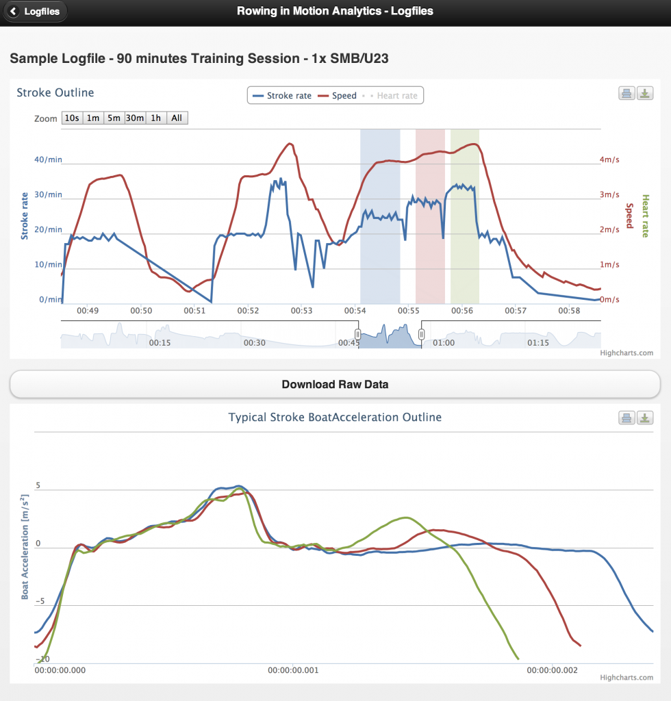
Rowing in Motion Analytics is meant to help you improve your rowing technique by allowing you to compare typical stroke patterns from different sections of an exercise. In this example, we dissect typical boat acceleration at three different stroke rates (24, 26, 28) performed in a pyramid exercise.
Start by opening your logfile and using the zoombar (the small outline below the main graph) to zoom into the graph. Alternatively, you can use the quick-zoom buttons on the top left to choose a fixed zoom setting (i.e. 5 minutes).
Next, drag your finger (or mouse if you’re using a PC) across the main chart to make a selection of the range you wish to analyze the typical stroke pattern for. After you have made your selection, you will see a line pop up in the graph below showing the typical acceleration pattern of the stroke for the selection you have made. You can make a new selection to add as many lines as you like to the graph.
In the example above, we can clearly see the increase in maximum deceleration at the catch as the stroke rate is increased. Correlated to this heavy deceleration at the catch is an increased acceleration of the boat during the recovery phase. There’s much more you can do with anaylzing typical stroke patterns, comparing different stroke rates and their effects on rowing technique is just one aspect of this.
Feel free to share your results with me in the comments and I’ll make sure to give you a tip to help you improve your rowing technique.

