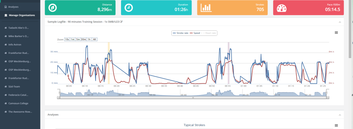
Analytics Design Refresh
In this post I want to give you a quick look at the refreshed user interface for Rowing in Motion Analytics and give you a short peek behind the scenes on why we did it and what we improved. If you’re curious, please try out the preview of the design refresh here: Analytics Design Preview.
Designing for Screen Size
Rowing in Motion Analytics is designed to be used on three different form factors: smartphones, tablets and desktops. Simultaneously designing for these different form factors is not easy, but we’re using a technique called “responsive design” that changes the layout of Analytics depending on the screen size of the browser window. This allows us to optimally use the available screen space to display relevant information in one place, while having the same content available on small screens using navigation (i.e. scrolling or nested pages).
The design refresh were making available as a preview today uses the latest techniques in this area and considerably improves our ability to adapt Analytics to different screen sizes. I want to highlight three changes in particular.
Stroke Metric Table
One area where we could improve Analytics is the display of the typical stroke metrics table.
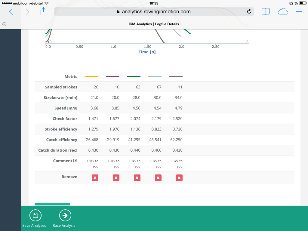
The typical stroke metrics table now shows metrics by row, which allows us to display all metrics even on small screens.
Menu
The menu is now unfold by default, which makes it more “discoverable” to users that are not yet accustomed to the “unfoldable menu” pattern. When collapsed, it will also not hide completely on tablets and larger but icons will remain visible, allowing a quick navigation. To preserve screen space on smartphones, the menu will hide completely when collapsed.
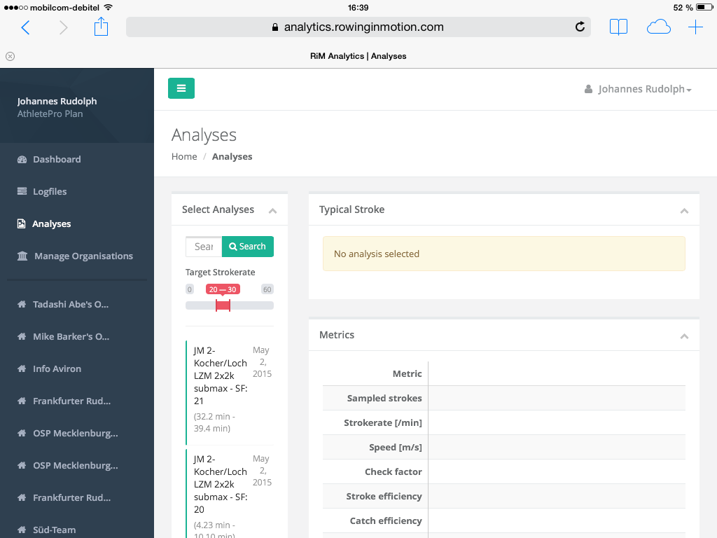
The unfoldable menu on a tablet. The button with the three horizontal bars at the top allows toggling. We also added quick-links to the Organisations you’re a coach in.
Lists
We use lists in a couple of places, e.g. devices, subscription history and a few others. Lists are now more compact and do also consistently indicate whether items are selectable (green) or not (gray).
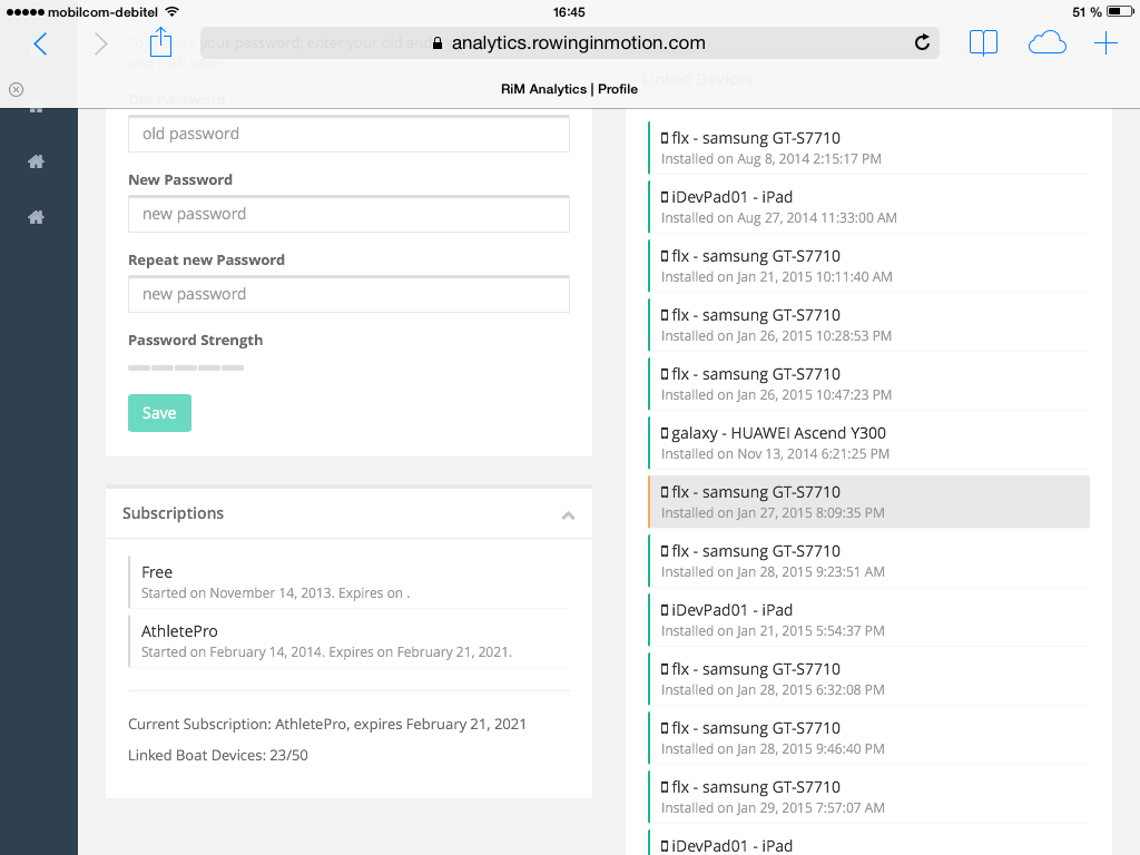
Lists are now more compact and do also consistently indicate whether items are selectable (green) or not (gray).
Comparing Analyses
We also gave the “Compare Analyses” screen a slight redesign, which should make it easier to use by keeping information on the selected analyses not in the “Search and select” compartment on the left where it is only displayed until you start searching for another analyses.
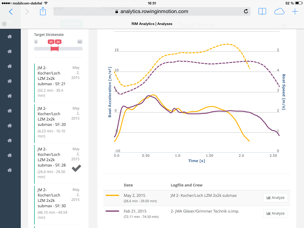
The compare analyses view now shows information on selected strokes underneath the graph.
Better Feedback
Another aspect that we improved is the feedback given by the user interface when an operation needs to happen in the background, e.g. on the login form. Buttons that perform such operations do now display a spinner while the operation is running to indicate that Analytics is doing something on your behalf.
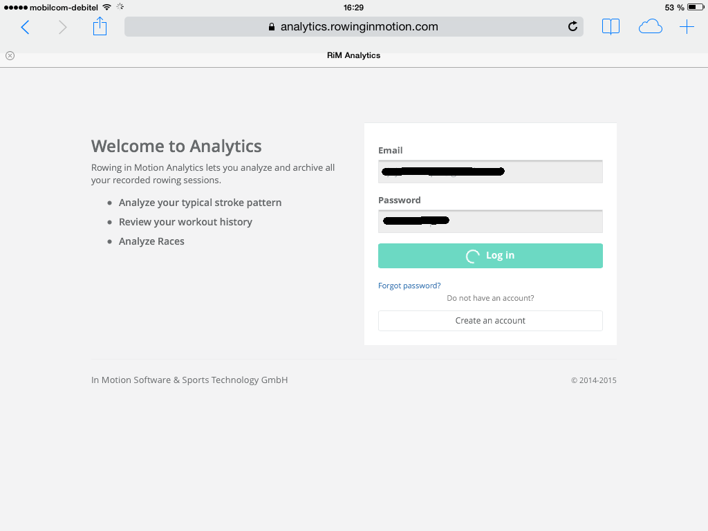
Buttons that perform asynchronous operations now show a spinner while loading.
In other cases, e.g. when saving something in the background, Analytics will notify you once the operation is completed with a message in the top right corner.
Evolution of the design
I though it would be fun to show a short history of the Analytics user interface along with the principal components and frameworks we used (for the technically inclined).
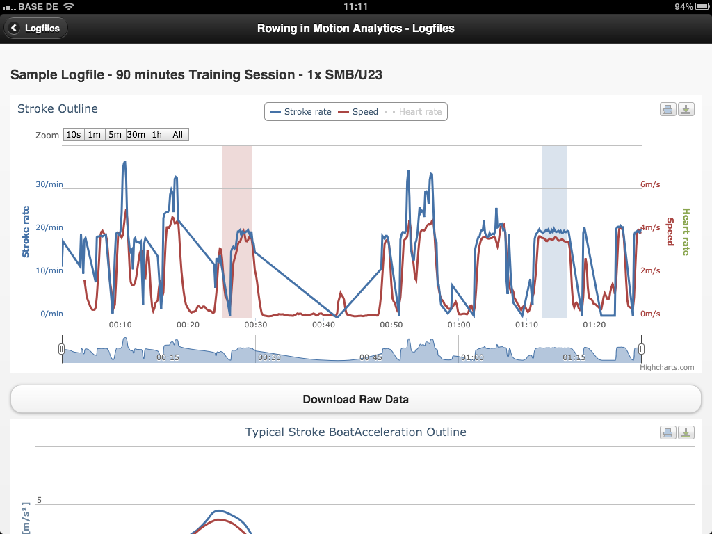
The very first version of the Analytics interface during the beta was based on jQuery Mobile and was thus optimized for smartphone (primary) and tablet (secondary) usage. We quickly realized that a lot of users were using their desktops/laptops to analyze rowing sessions after the fact and would want to make better use of the available screen space. Version 2 of the user interface was thus based on Bootstrap (v2.3) and a custom design that tried to mimic the (then-) current trend of “Metro UI” as it is found in Windows 8 with a tiled interface and bold colors. Together with this version we started using angular.js as a client side javascript framework.
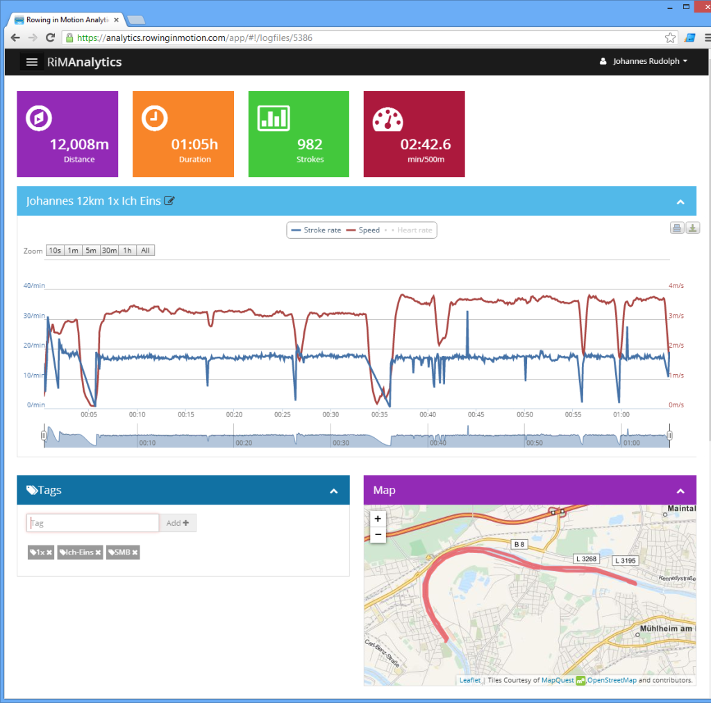
The new design represents the third revision of the Analytics user interface and is based on the most recent versions of the Bootstrap and the angular.js framework. We preserved some aspects of the previous design that we found worked really well, such as the toolbar and the collapsible components on the screen, but removed almost all of the bold colors and focused on making it look cleaner and more consistent.
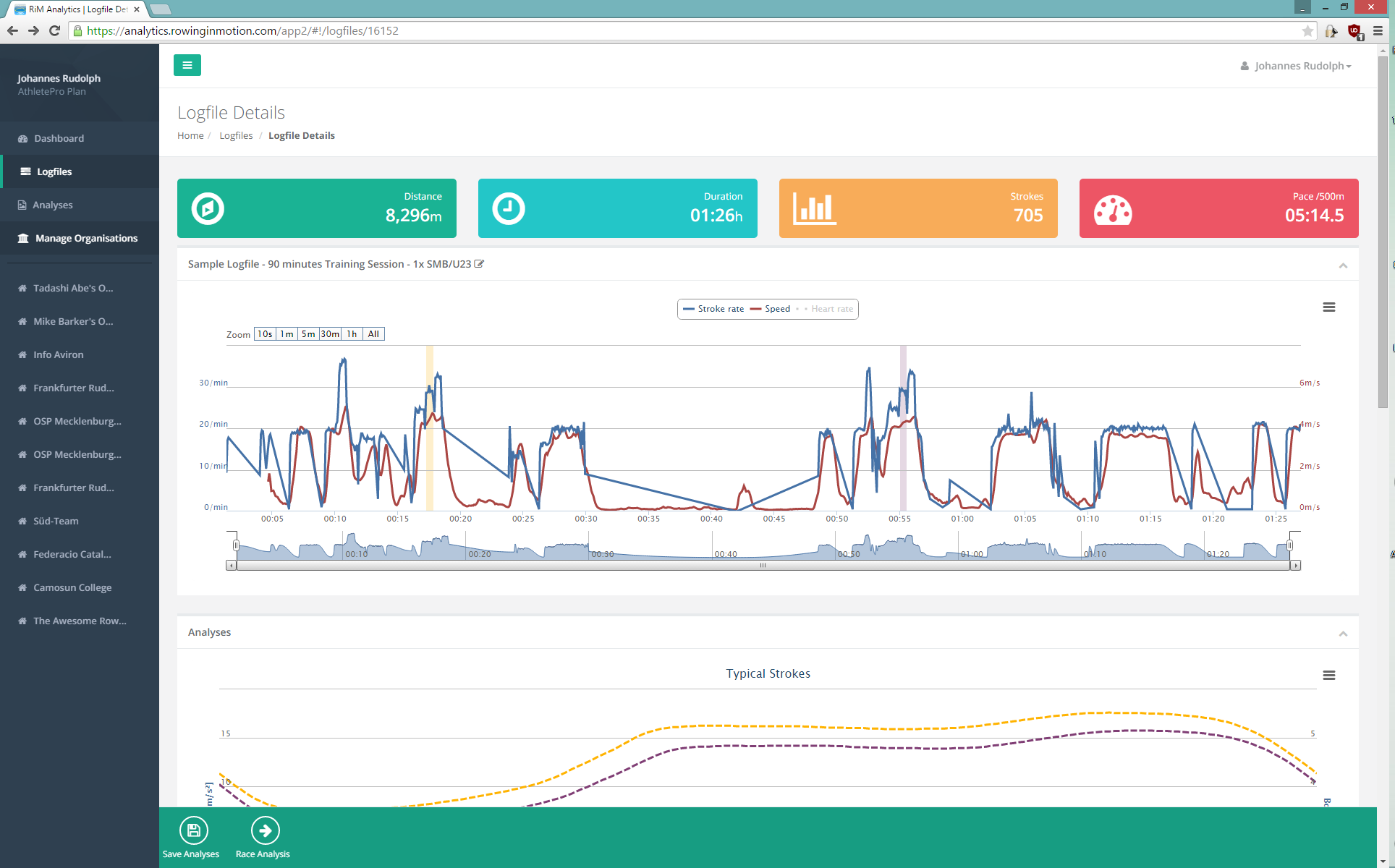
I hope you agree with me that Analytics has become better and better with each iteration. If you haven’t done so yet, I’d invite you to check it out here and leave me your feedback on the Rowing in Motion Forum Discussion .

Looking good! I have two suggestions that may be beyond the scope of this overhaul but here goes anyway: 1) Please make the map interactive so that, as one drags the cursor across the plot of stroke rate and speed, one can see exactly where they are over the ground. I row under a lot of bridges and they invariably cause aberrations in the data. When I see the data plot looking weird, it’s nice to be able to confirm that it was caused by a bridge and not some other issue. When you get that done (thank you!), please move the map back up under the plot so that I can see it as I move through the plot. 2) You kindly offer the ability to download the analytics chart in various formats and that’s excellent. But please include the table of metrics in addition to the chart itself. Related: I understand the need to accommodate various screen sizes and hence the change in the layout of the metrics table but I prefer the old method.
Thanks and keep up the great work!
Mike
Thanks for the feedback Micheal! Interactive map is something we want to do indeed in the near future. The table layout was a difficult decision, but it’s something I’m still looking to improve. Maybe the new pattern we use (make the table scrollable on small screens) would work well with a horizontal layout?
The reason its vertical at the moment (i.e. metrics are rows and strokes columns) is that we might add some more metrics in the future and then things get unwieldy….
This might not be the best place to suggest this, but, 1. Add a start stop button, or restart button on the rowing screen. Also, add an option to pause recording when the boat goes below a certain speed. This would help when rowing pieces. Another nice option would be to be able to set up interval times so I don’t have to watch the clock.
Hi Debbie, we’re tracking this here: https://forum.rowinginmotion.com/t/feature-allow-measured-pieces-workouts/68